Product Design • Leadership

Palette: Building & Running a Design System as a Product

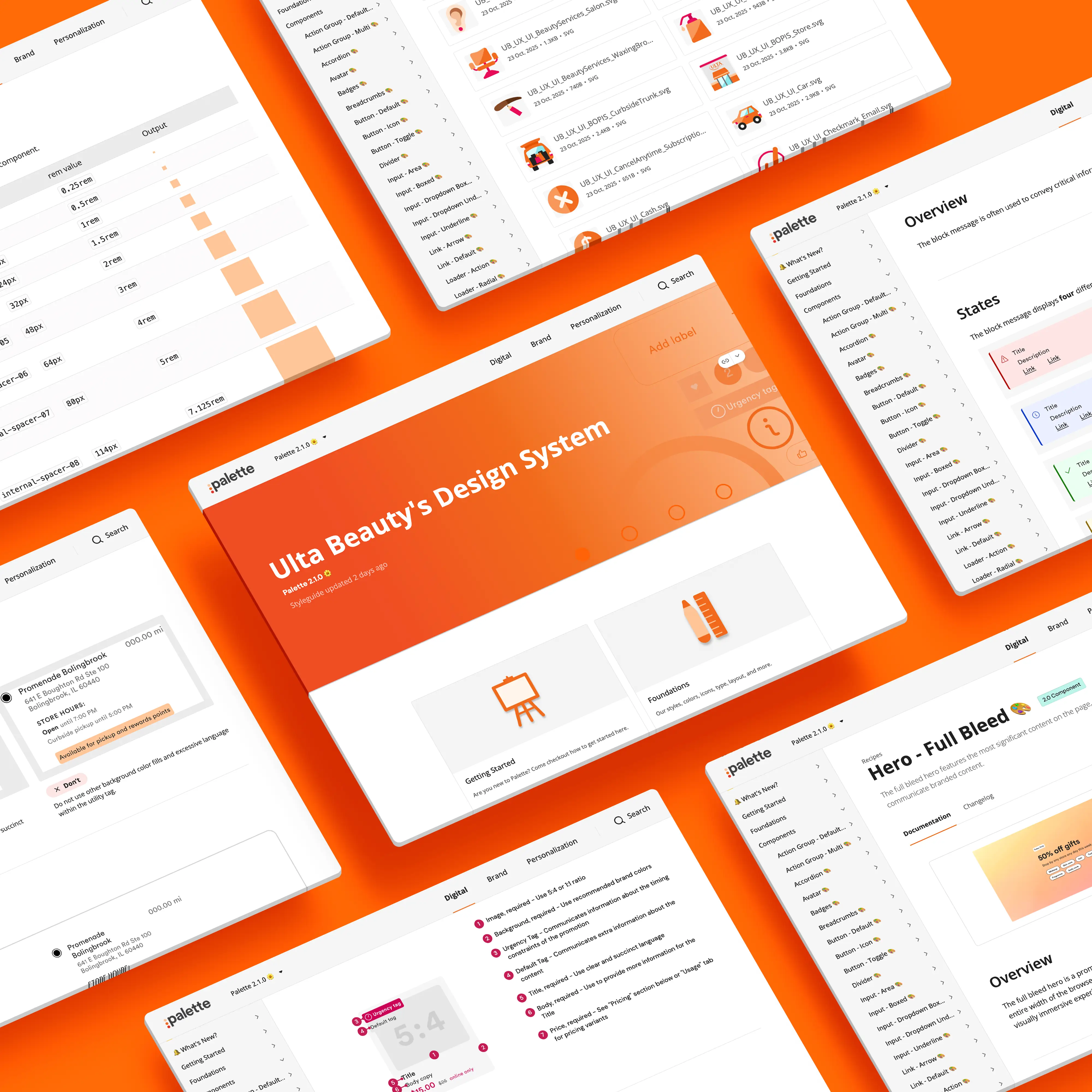
I was Ulta Beauty's first product designer. Over nearly 12 years, I took Palette from an idea I pitched on the side to a funded 20-person shared service spanning design, engineering, and QA, serving 20+ product teams across web, native iOS and Android, and in-store tools.

Palette wasn't a library. It was the operating system for how Ulta Beauty built digital product: token architecture, components, documentation, governance, and the tooling that kept design and code in lockstep. It made design and development roughly 40% faster, and it held WCAG AA from design decisions through shipped code.

I founded it, architected it, documented it, and eventually managed the team that ran it.

Palette components

01The Problem

Ulta Beauty's digital surfaces grew fast, and the UI grew with them, in every direction at once. Before Palette, every team solved the same problems independently: their own buttons, their own spacing logic, their own interpretation of the brand.

I audited what we'd shipped and counted the damage:

  • 142 link styles
  • 54 button styles
  • 44 heading styles
  • 19 font families

None of it came from carelessness. It came from speed without shared infrastructure: autonomous teams with no visibility into what already existed, where building new was faster than finding what was there. The cost showed up everywhere: slower delivery, inconsistencies customers could feel, and design debt compounding with every release. Major initiatives like the app redesign made the math undeniable. We needed a system.

Palette components

02My Role

I founded Palette and led it across its whole arc: first as the hands-on systems designer, then as the Product Design Manager running it as a funded shared service.

  • Pitched the system to leadership and turned side-of-desk advocacy into dedicated funding: a 20-person team across design, engineering, and QA
  • Defined the token architecture, component standards, and the governance model
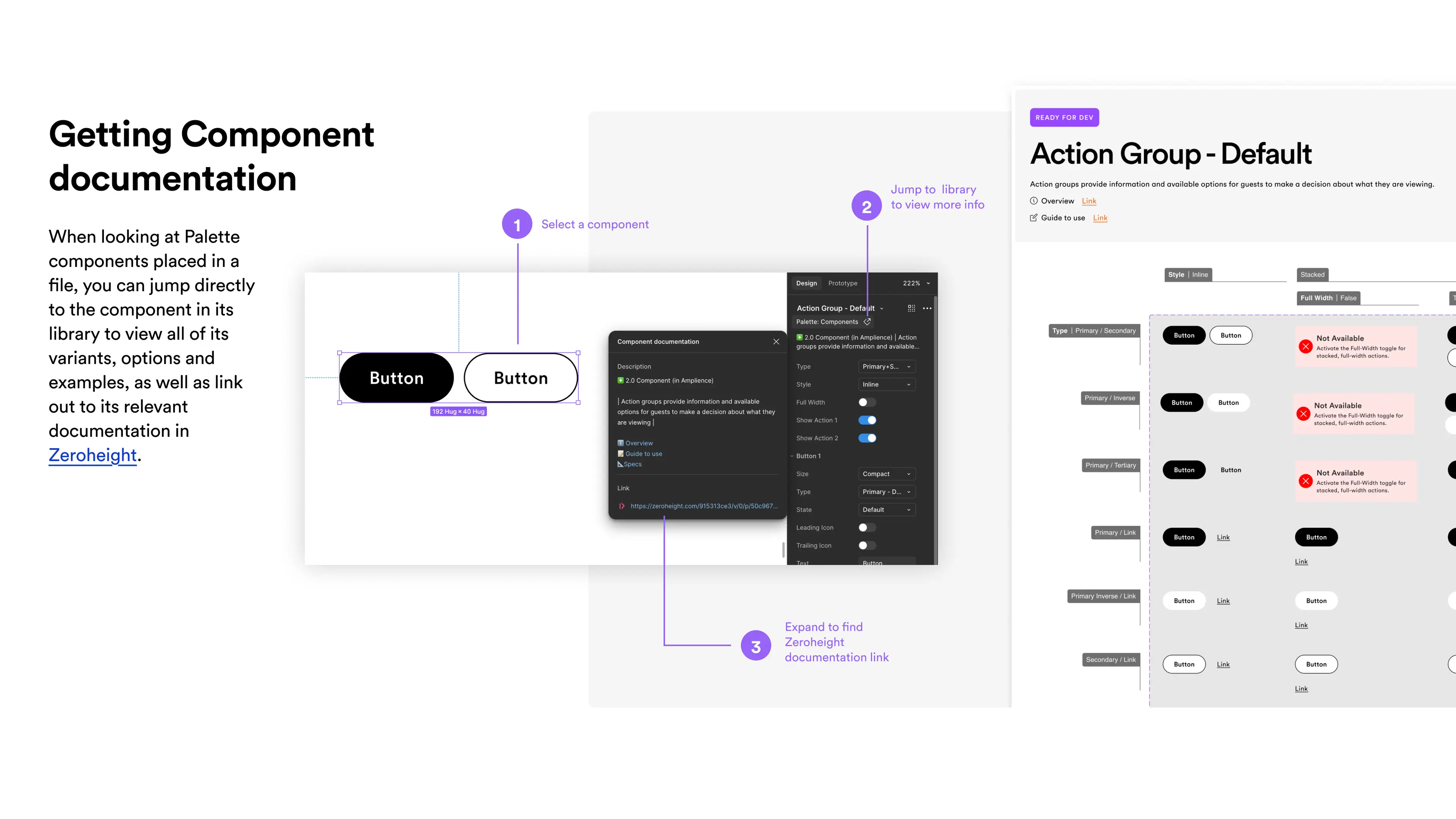
  • Wrote the documentation myself, standing up Zeroheight from scratch and later moving the system's source of truth to Storybook alongside the code
  • Led the org-wide migration from Sketch to Figma, then built the pipeline generating the JSON behind our Figma variables
  • Partnered with engineering on component APIs, implementation fidelity, and release process
  • Ran adoption: onboarding, office hours, intake, and cross-team support
  • Managed a 7-person design team and mentored across a 30-person design org
Palette Documentation

03Token Architecture

The token system was the part of Palette I kept closest, because it's where a design system either scales or quietly falls apart.

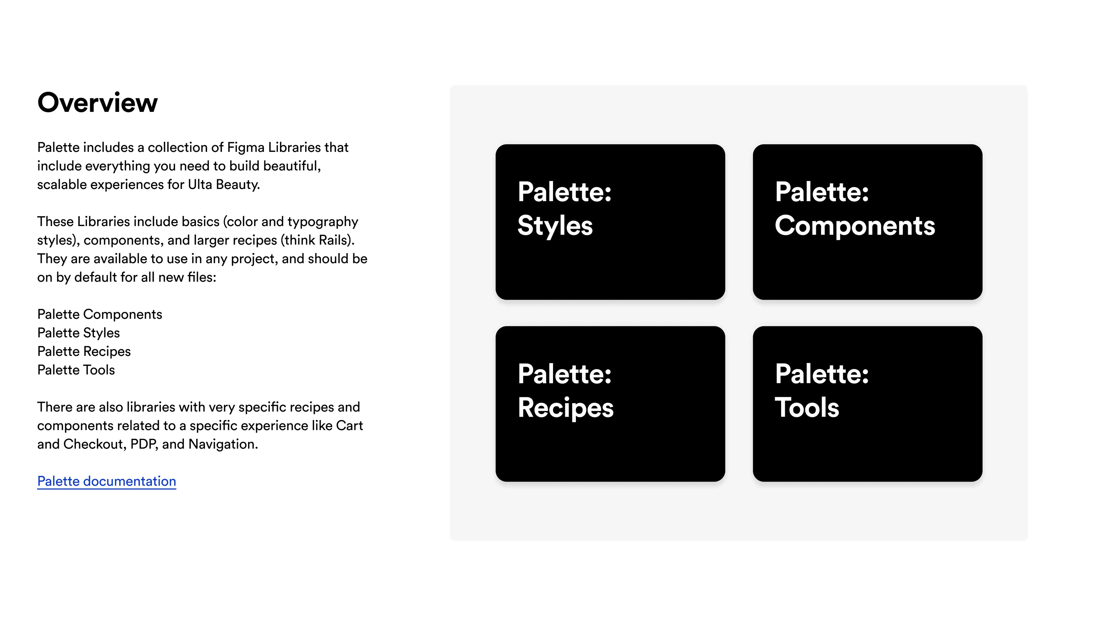
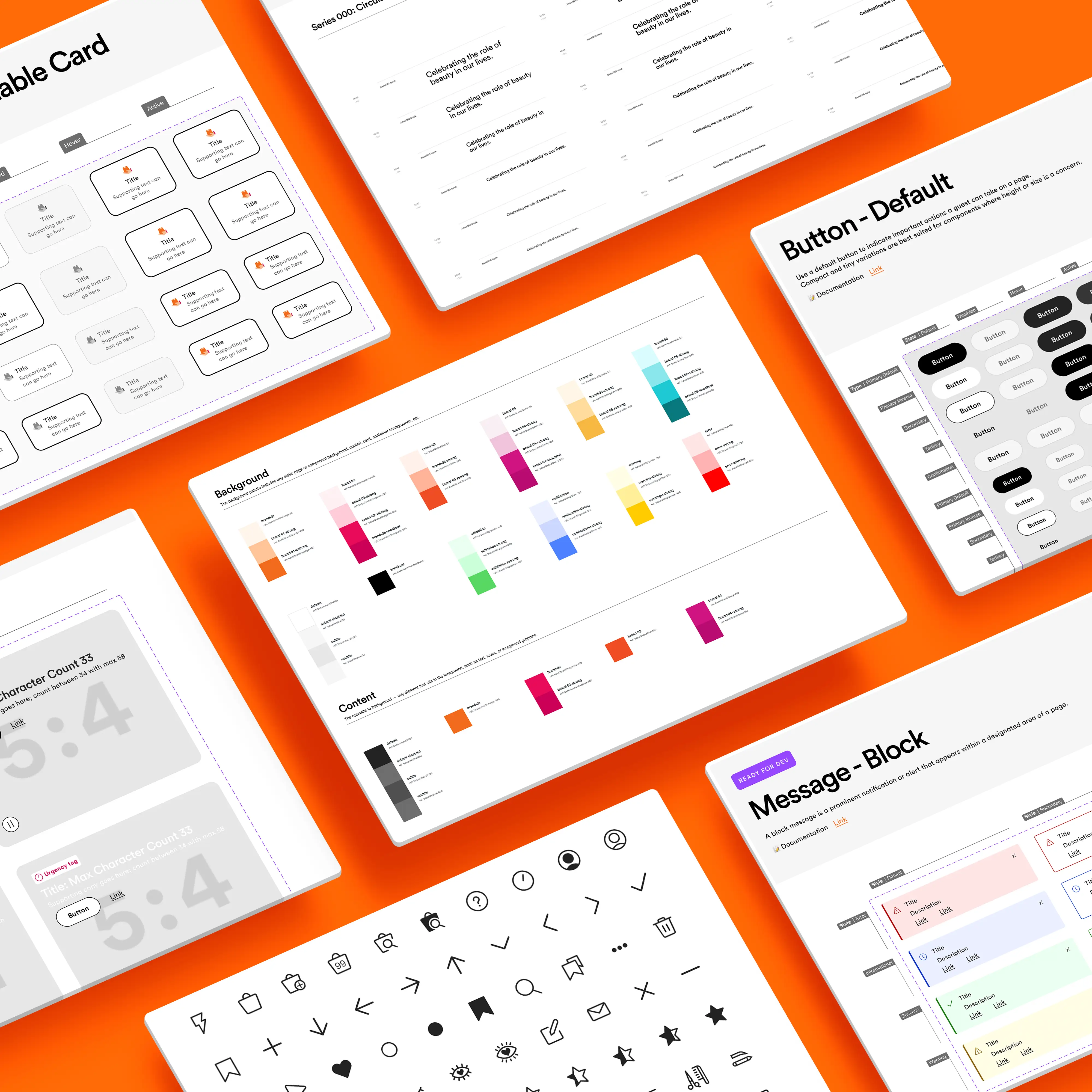
We built a layered architecture with three tiers we called Styles, Components, and Recipes. Styles held the foundations: primitive values and the semantic tokens carrying intent (what a color means, not what it is). Components consumed Styles instead of raw values, so a change at the Styles layer moved through the system safely. Recipes sat on top, capturing how Components compose into repeatable patterns, so teams assembled proven combinations instead of reinventing them.

The layering was a deliberate tradeoff. A flat token set is simpler to start and faster to break: every rebrand, theme, or platform difference becomes a find-and-replace across the whole system. Semantic layering costs more up front, in naming debates and education, and pays it back every time the system has to change without breaking its consumers. With four platforms consuming Palette (web, native iOS and Android, and in-store tools), change without breakage was the whole job.

Theming proved the architecture every year. Each holiday season, Ulta Beauty's brand colors swapped to holiday colors across the entire experience. Because intent lived in the semantic layer, the shift shipped by remapping values, not redesigning screens: same components, same layouts, new theme underneath, then back again when the season ended. A full seasonal rebrand during retail's highest-stakes stretch, handled at the token layer.

The pipeline mattered as much as the structure. When Figma shipped variables, I built the generation layer that produced the JSON behind them, making our token source machine-readable and keeping design and code synchronized from one origin instead of two hand-maintained copies. That decision, tokens as structured data rather than documentation, set up everything Palette did later with AI.
Palette Documentation

04Components & Foundations

With tokens as the base, we rebuilt the component layer for scale:

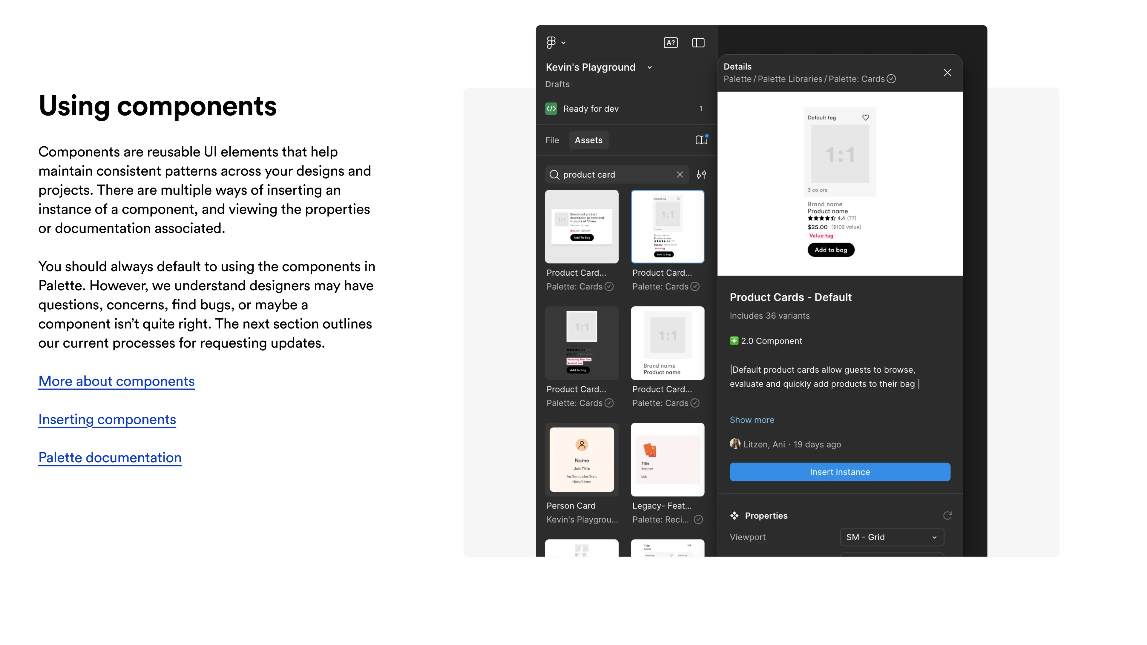
  • Core components redesigned with full anatomy: variants, states, responsive behavior, and accessibility built in rather than bolted on
  • WCAG AA held as a system requirement, from contrast standards in the foundations to checks against shipped code
  • Engineering specifications and usage guidance shipped with every component, so a pattern was never done until it was documented

The goal was to make the right way the easy way. When a component carries its own logic, guidance, and constraints, teams stop reinventing and start composing.

Palette overview
Palette Libraries

05Documentation & Governance

Teams adopt what they trust, and they trust what they can see: how decisions get made, what changed, and why.

  • I wrote the documentation personally: component anatomy, behavior rules, do and don't patterns, accessibility guidance
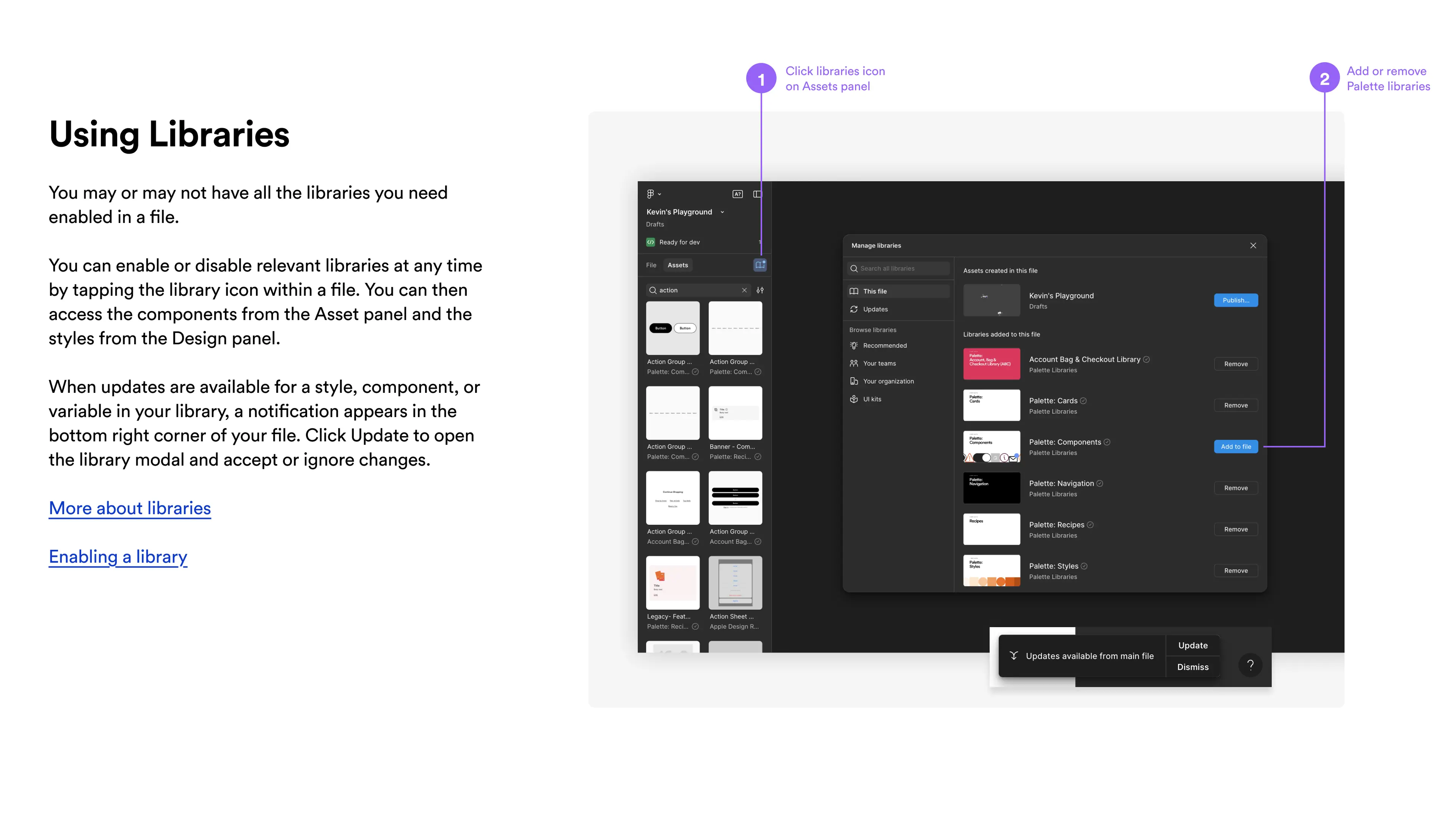
  • Our source of truth evolved with the system: Zeroheight, stood up from scratch, in the early years; Storybook, living beside the code, as the system matured. Moving the docs closer to the implementation was itself a governance decision
  • Versioning, release notes, and a clear contribution path kept changes transparent and drift low
  • Palette became part of onboarding: new designers and engineers learned the system in week one
Palette components

06Adoption & Impact

Systems don't get adopted because they exist. We ran adoption as a program:

  • Weekly office hours and a cross-team intake process, so the system had a front door
  • Shared Figma Dev Mode workflows and alignment sessions to shorten handoff
  • Direct support on major initiatives, including the app redesign and the checkout overhaul

The results: 20+ teams building on one foundation across four platforms, design and development cycles roughly 40% faster, and one coherent experience across app, site, and store. The 40% came from sprint data: before-and-after delivery comparisons and story pointing, where the same teams got more done per sprint once they were building on Palette.

Palette components

07Where Palette Went Next: AI in the System

Because our tokens lived as structured data and our documentation as a maintained source of truth, Palette was ready for AI before AI was ready for design systems.

We put it into production in two places:

  • Documentation automation: AI drafted component documentation for Zeroheight and Storybook, and kept guidance in sync as the system changed
  • Token generation: AI generated and validated the token JSON feeding our Figma variables

The lesson generalized. A design system now has three readers: designers in Figma, engineers in code, and the AI tooling that's starting to generate product UI. Systems built as structured, machine-readable intent serve all three. That's the standard I'd build to from day one.

08Lessons

Palette was the most strategic work of my career, and it taught me as much through what I'd change as what worked.

What I'd do differently: invest in contribution models sooner. In the early years everything flowed through the core team, and that control was how we protected quality. As adoption grew, it turned us into the bottleneck: teams waited on us for work they could have done themselves with the right guardrails. When we opened real contribution paths, with criteria and review, the system got faster and better. I'd build that muscle from year one. A system only its core team can evolve doesn't scale, it queues.

What we outgrew: Zeroheight. I stood it up from scratch, and for years it did exactly what the system needed: one place for truth when we'd never had one. But documentation that lives apart from code drifts from code, and as Palette matured, keeping two sources honest became its own job. We moved the docs into Storybook, beside the implementation, and the gap closed. Deprecating something I built myself was the right call, and it left me with a test I still apply: a system's tools have to earn their place in the current era, not the era they were built for.

What held up: running the system as a product. A roadmap, an intake process, versioning, support, and a team funded to do the work. Design systems fail as side projects and compound as products. That conviction is what I'd bring to the next one, at any scale.

next project

Modernizing Ulta Beauty’s Digital Experience